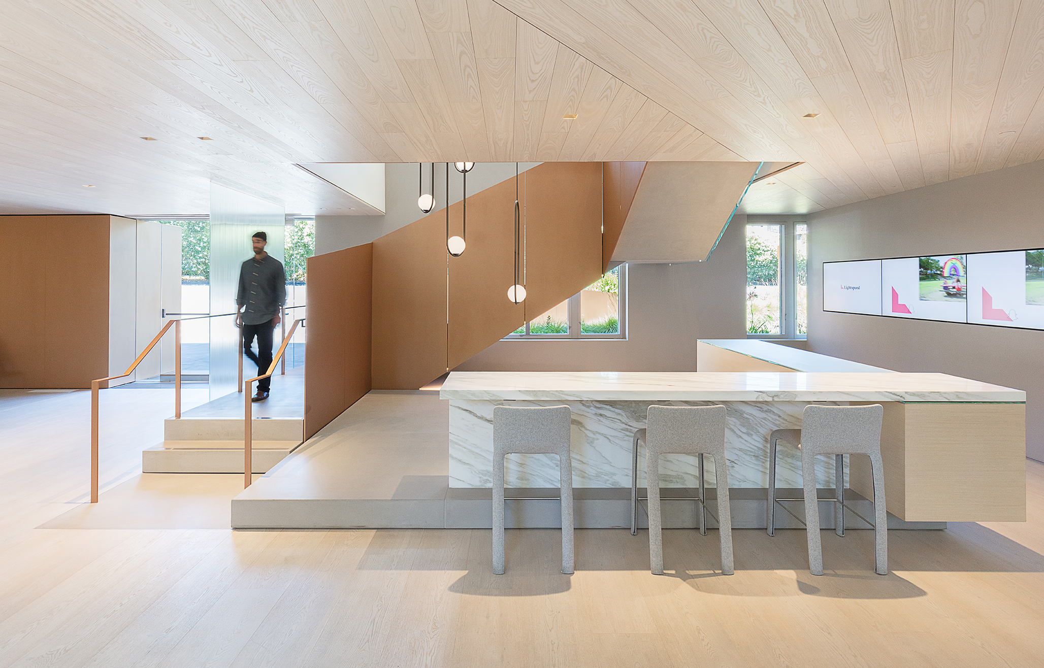
Luma’s confidential venture capital client wanted a “smart, upbeat, and confident space; one comfortable in its interpretation of west coast modernism and its interplay of warm materials and light,” describes Jonathan Plumpton, Luma’s Project Manager.
The simple end goal: brighten up the client’s Silicon Valley office with a distinctly polished style.
“The whole feel is one of refinement, not too foreboding, approachable. It’s a play on the image of the company – very sophisticated,” said Jonathan.
Luma’s lighting plan relied on a unique use of borrowed light from one area to another. More than daylighting, this technique allows light from one space to bounce into another space, effectively saving energy costs and extending views while adding a sense of spaciousness.
Taking cues from the project site and the interplay of daylight in the design, the team employed a technique of borrowed light to inform the design of the project. The building's exterior, particularly the central courtyard, is framed by large windows letting in abundant natural light from the courtyard filtered by its characteristic old oak trees.
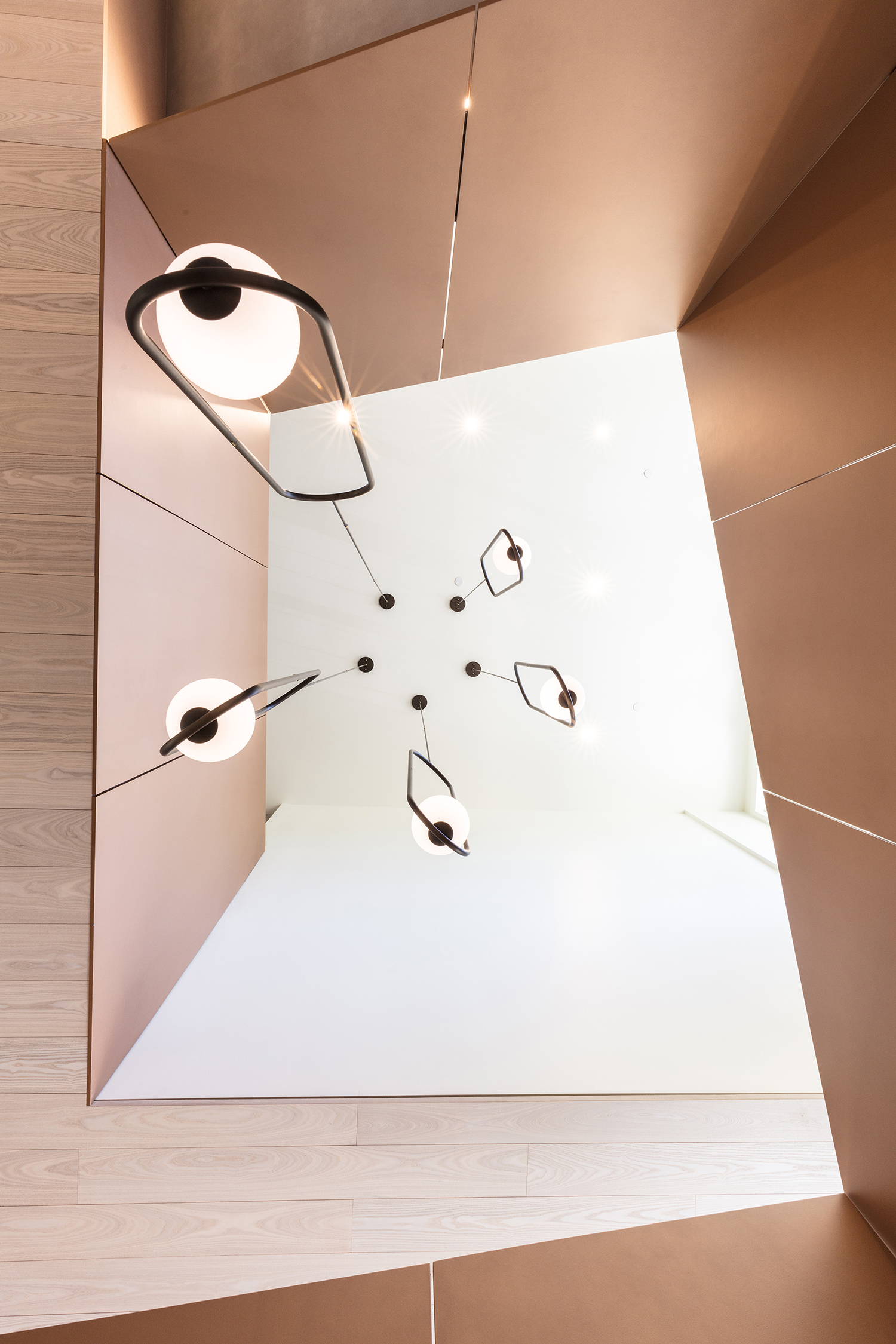
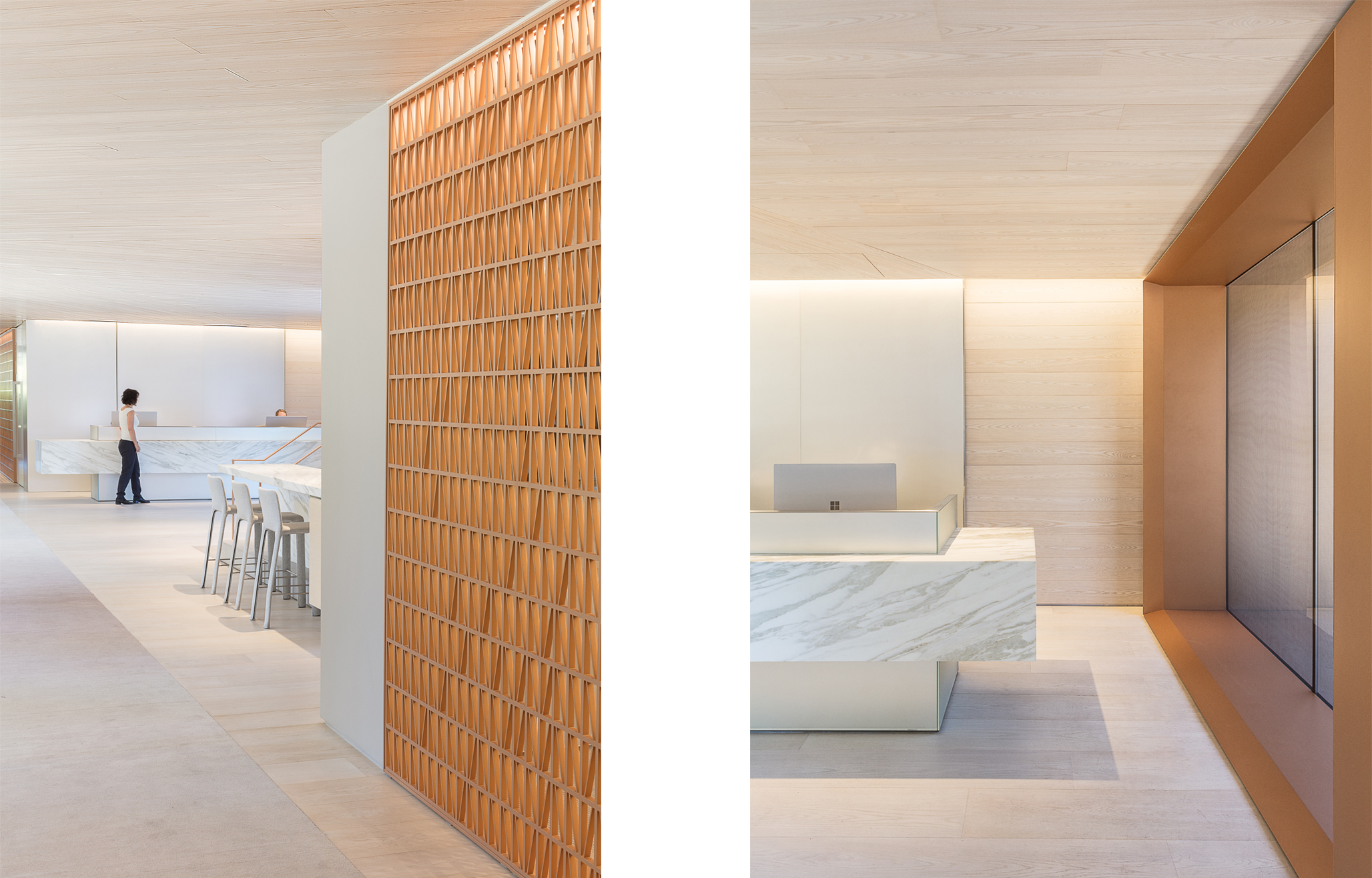
Designers integrated lighting into the material surfaces, which allowed the space to breath and be illuminated without putting focus on the fixtures themselves. Through this minimalist and sensitive approach to integrating the lighting, the design enhanced the warmth of the materials. The space breathes with light emanating from concealed locations: hidden uplights, ceiling reveals, and screens, all are seamlessly integrated into the architecture of the space. Where the fixtures do stand out, they become statement pieces meant as pivotal points and moments in space.
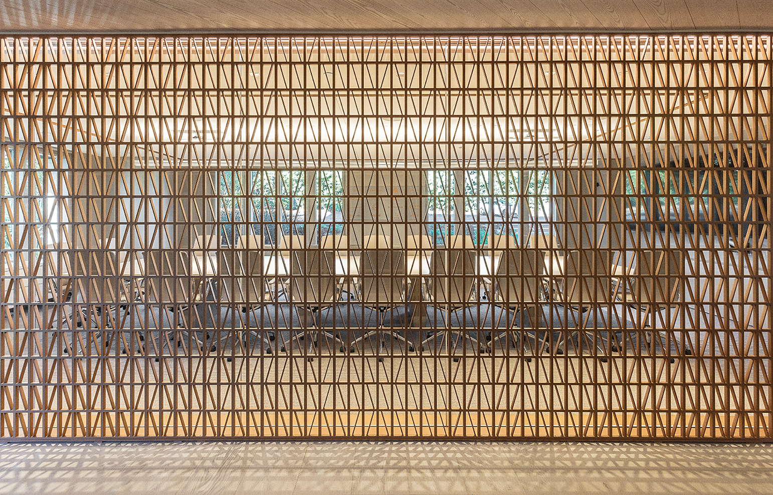
For example, custom bronze screens acted as walls between meeting rooms and hallways—allowing views into the conference rooms in some areas, while blocking views in others. Lighting the interior while keeping the screen useable was a design challenge where Luma learned to push typical project boundaries.
“Controlling the angle of light in how we lit the screen, creating the play of shadows and texture in the hallway was tough to predict. We had to work with the constant interplay of light and the ongoing development of the final form and structure of the metal screen,”
Jonathan said.
The final success of the bronze screens resulted in greater confidence to test by trial and error, while breaking some of the rules along the way.
So far, their willingness to take risks has helped the project win a 2019 AIA San Francisco Citation Award for Interior Architecture.
- 1
- 2
- 3
- 4


